|
|
|
|
|
|
|
|
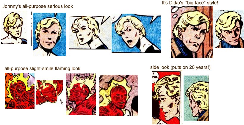
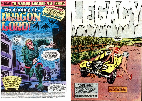
Comparing A legend (Steve Ditko) with a modern master (John Byrne)
Many people dislike cartoon art. On this page I will argue that it is the best way to display energetic, active realism: it leaves the artist free to think about the ideas. Trying to be too photographic restricts what can be shown.
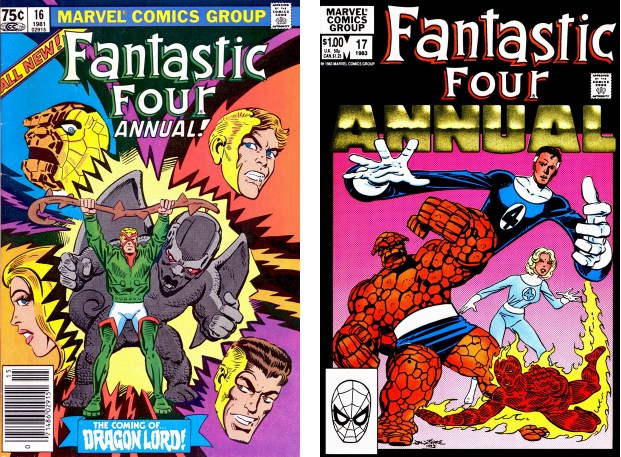
To illustrate the power of looser comic art versus tighter more
photographic art, this page compares FF annual 16 (the looser Steve
Ditko style) to FF annual 17 (the tighter John Byrne style). Most fans
prefer Byrne because he is more photographic. Here I argue that Ditko's
added freedom allows him to present more action, more locations, more
emotions, and more complex, deeper stories.
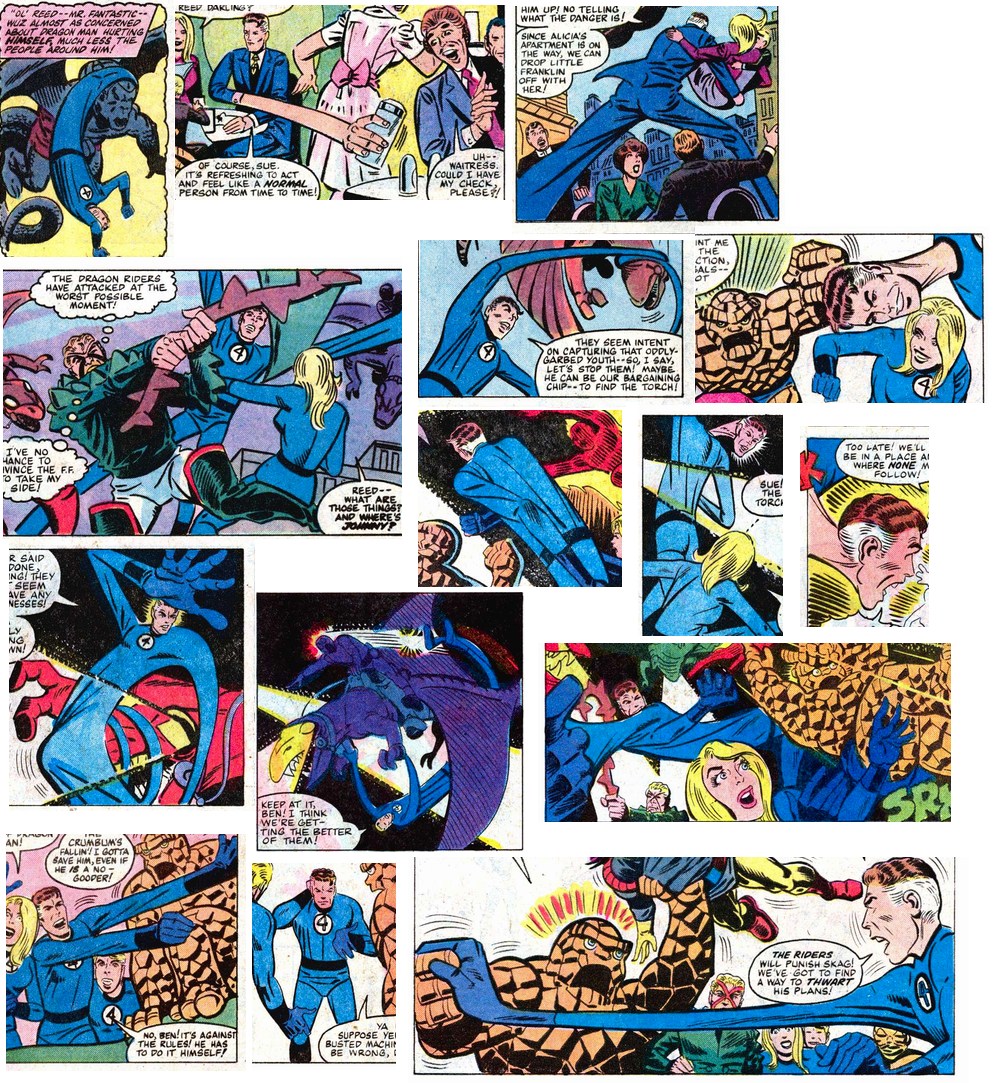
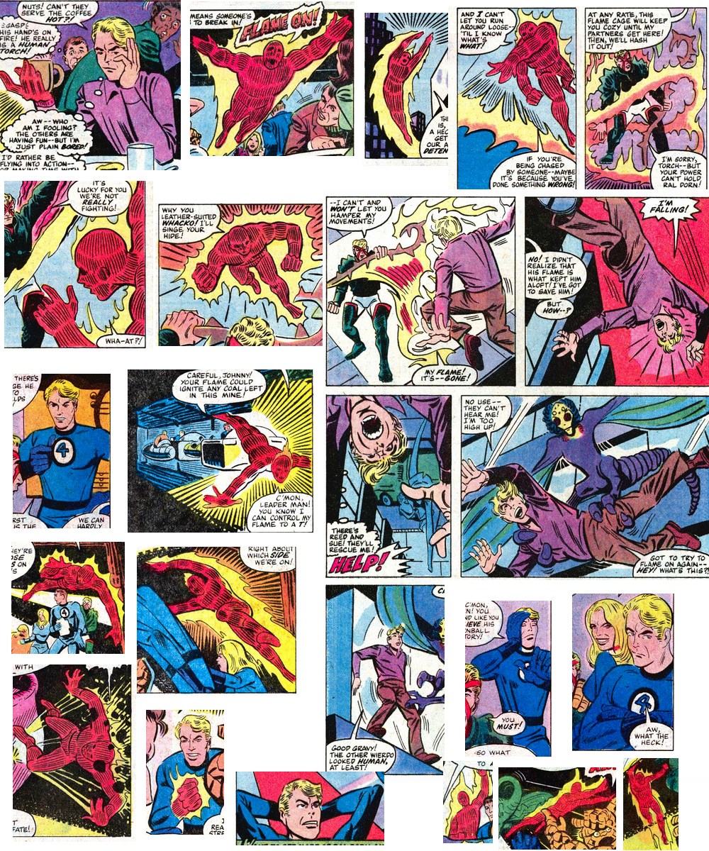
Let's start with a montage of Ditko images, just t remind us that yes, they guy can draw!
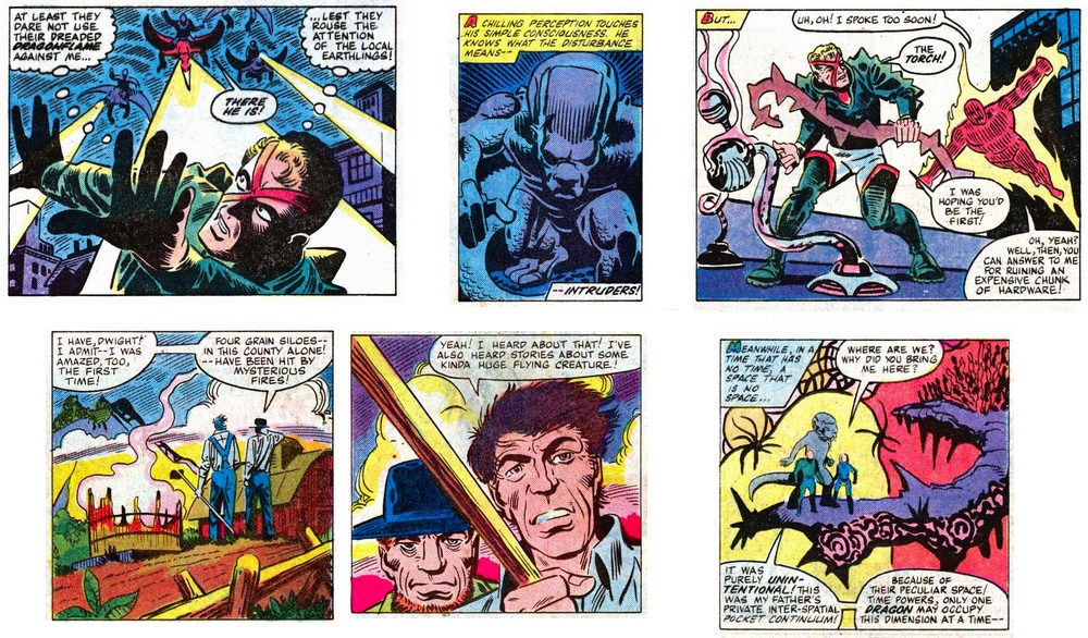
These pictures show why I love Ditko's art:
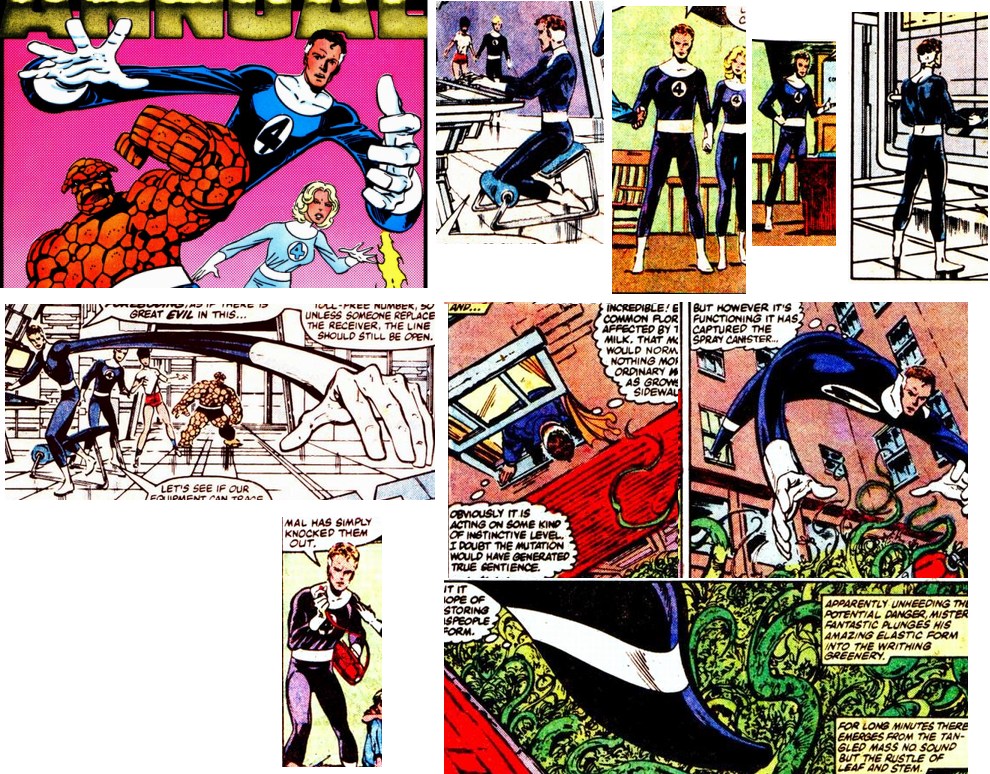
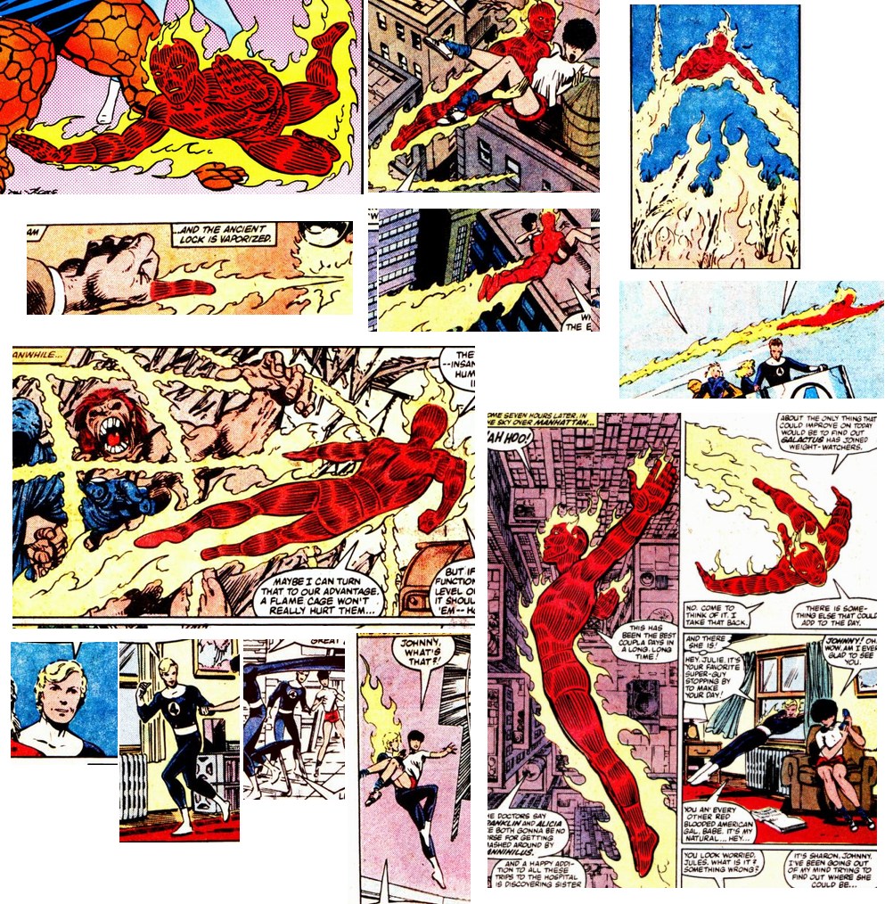
For comparison, these are some highlights from Byrne, also master of
the comic craft. The images are a little more photographic, but that
restricts what Byrne can do with them.
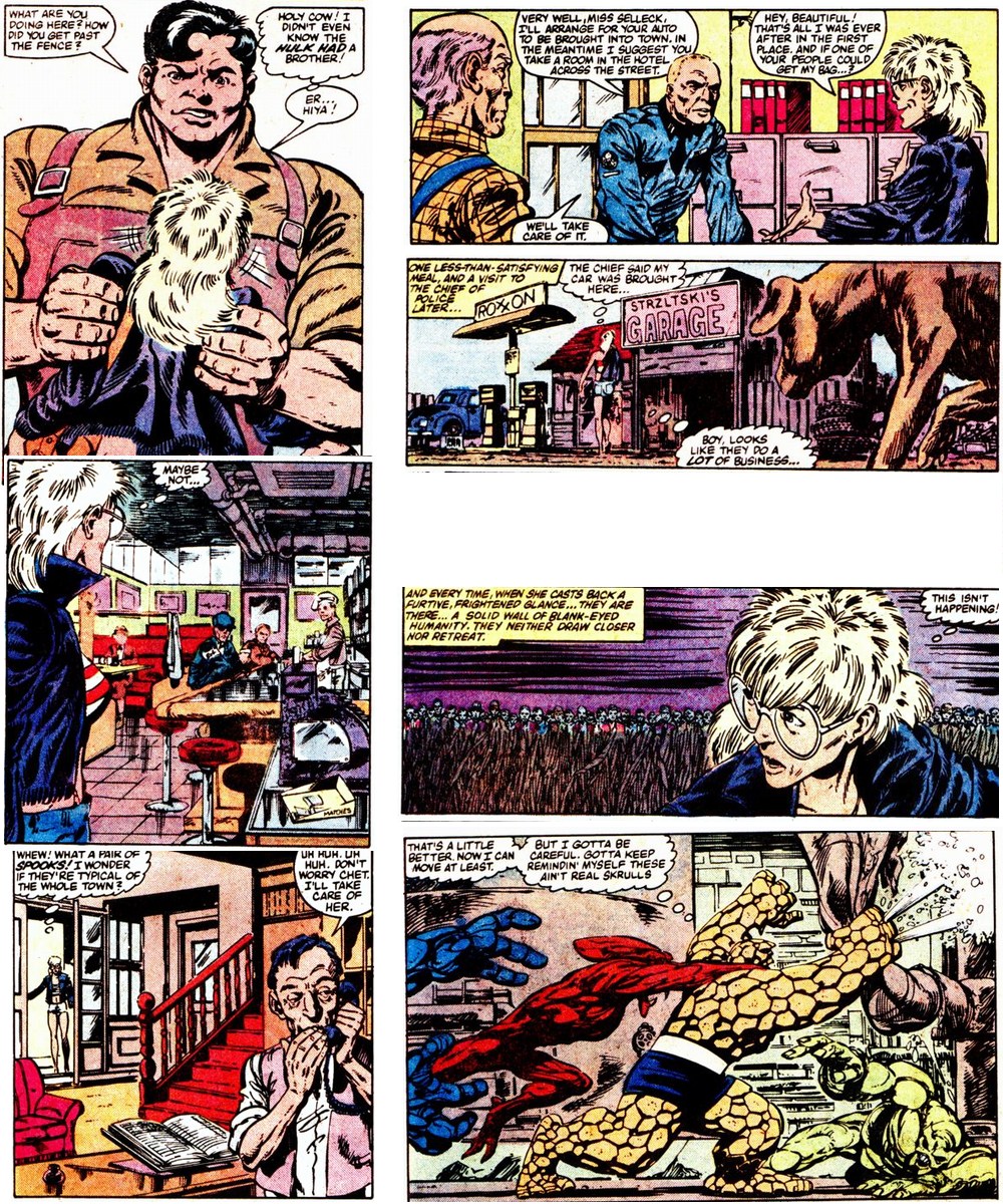
Byrne has good composition, dramatic scenes, and a range of scenes. But Ditko's art (to my eyes) has better composition, a bigger variety of scenes, cleaner lines, brighter colors, more dangerous situations, and so on. And whereas this story copies from the movie "Invasion of the Body Snatchers", Ditko's story is original.
Look closer at the locations: here we see Ditko's unique heightened
style: the mountains are higher, the colors richer, the hills rounder,
the trees more beautiful. And again, so much packed into one frame- see
the birds, the shimmering reflection, the bridge and cliff side, this my
favorite image from the whole book.
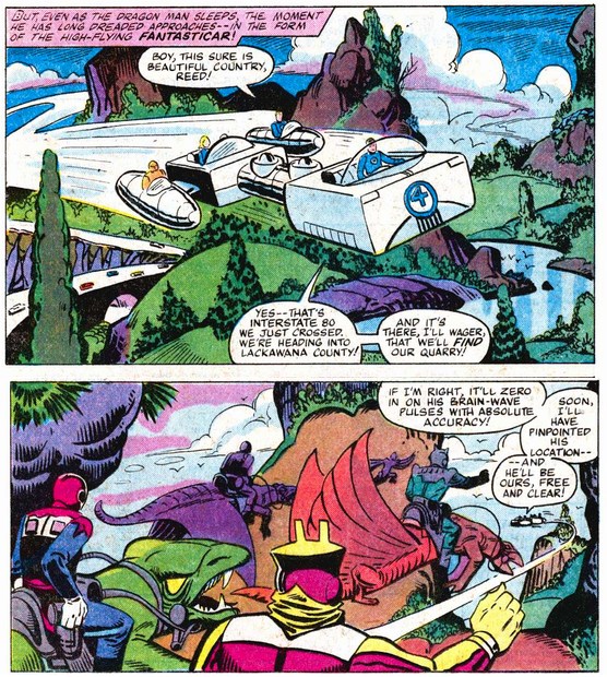
And it's all so deep and three dimensional - note how this same scene is seen from a different angle in the following chase scene. This is how Ditko makes his art more real than real: it's brighter, has more content, is more three dimensional (and this scene has characters from other dimensions!)
Note that Ditko is drawing a heightened version of a real place, and even names it: this is near Lackawanna country, Pennsylvania. You can see how he has compressed the beauty of the real location from this photograph (copyright Billy Hathorn, share-alike license via Wikimedia)

Now compare Byrne's view of the American landscape:
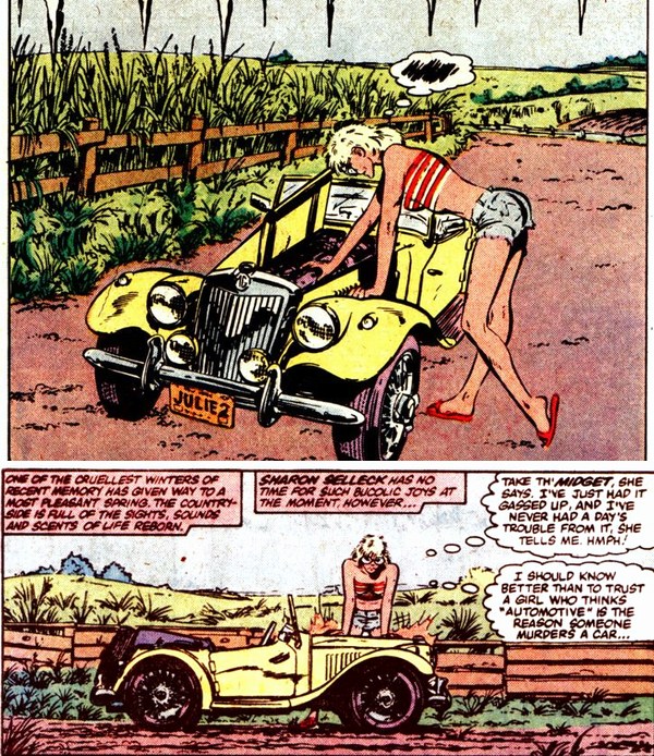
Byrne is more realistic in the sense of photographic. But this isn't a real place: "King's Crossing" does not appear on Google maps. So while it appears to be realistic it isn't real. And the drawing is rougher, colors are duller and you see a lot less. Compare with Ditko who basically compressed an entire state into a single frame! But I do love the MG Midget car. One of the early T series I believe? I hope I don't come across as too negative about Byrne's art. It's wonderful stuff. I just find that Ditko gives more.
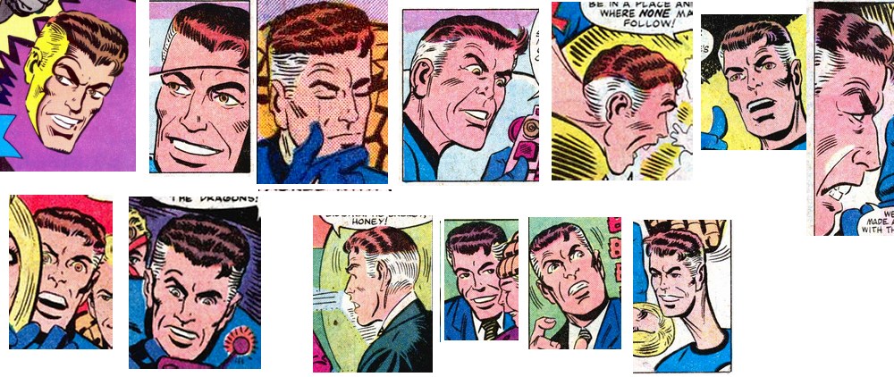
Byrne's faces have generic expressions, whereas Ditko's have a range of nuanced emotions. Compare Reed's look to Johnny's - Reed shows more confidence, almost a smile. Note that Sue is facing away. her facial features are enlarged slightly, so we can see the look in her eye and her forced smile, recalling her long friendship with dragon man, while knowing the danger he represents and the even greater danger of her friends overreacting. Ben's face seems to say "what the..? why are you disturbing me?"
In general, Byrne's cover contains no information about the story
inside, so his characters do not need complex emotions or expressions.
His cover is deliberately generic.
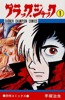
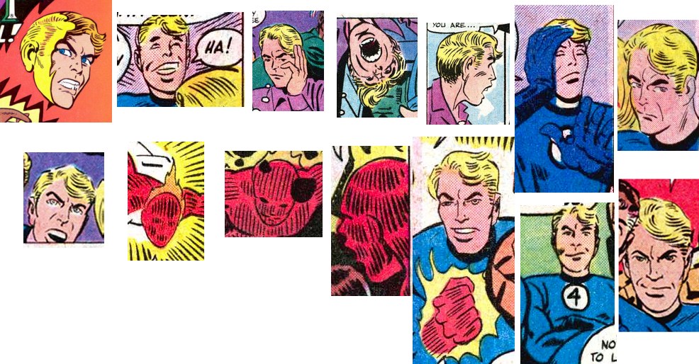
Enlarging the facial features allows for more subtle expressions. The technique is common in Japanese manga, the most successful comics in the world. These examples are from "Black Jack" and "Oishinbo", series that each sold over a hundred million copies:

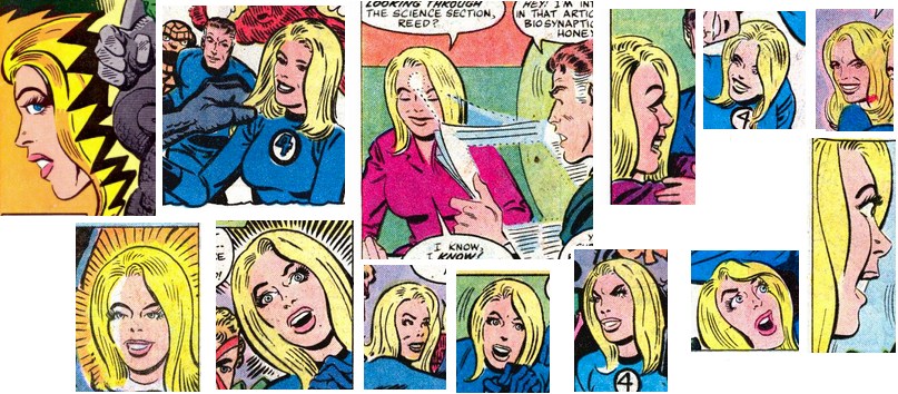
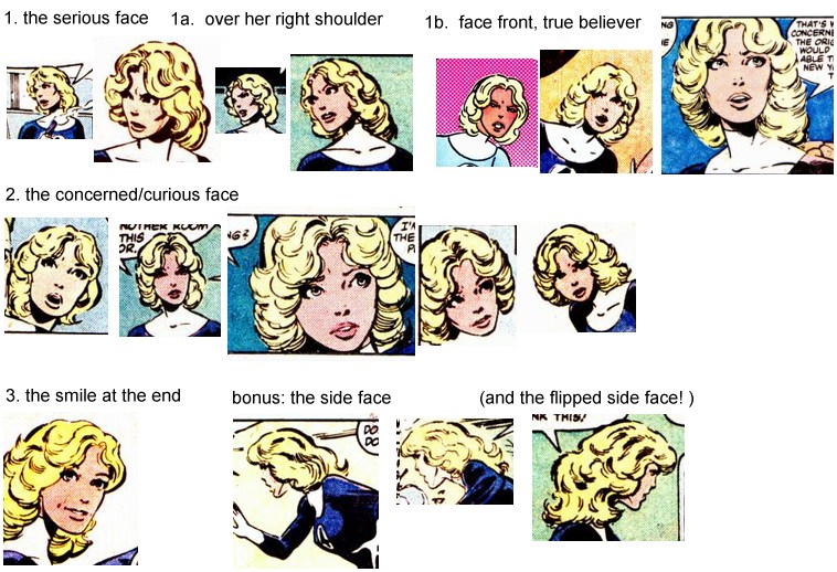
By expanding the facial features, Ditko has room to show the full
range of emotion. Note the subtle differences between two similar
smiles. This woman has many dimensions.
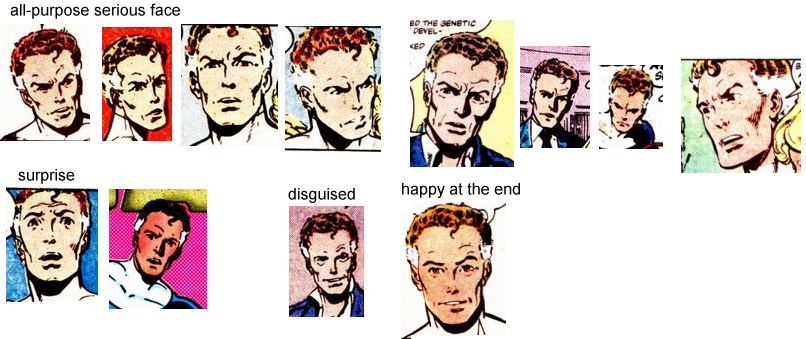
In contrast, in FF annual 17 Byrne's Sue only has three expressions. Possibly five if we're generous. In other stories Byrne gives her more freedom, but FF annual 17 is useful to illustrate the contrast between the freedom of stylized art and the restrictions of photographic art. Sue looks like she has a botox injection and can only manage the smallest facial movements:
The same applies to Ditko's Reed: we see a wide range of human emotions.
Byrne is more photographic, and being photographic is inevitably more
restrictive. When combined with small images and rough paper, subtle
expressions become impossible.
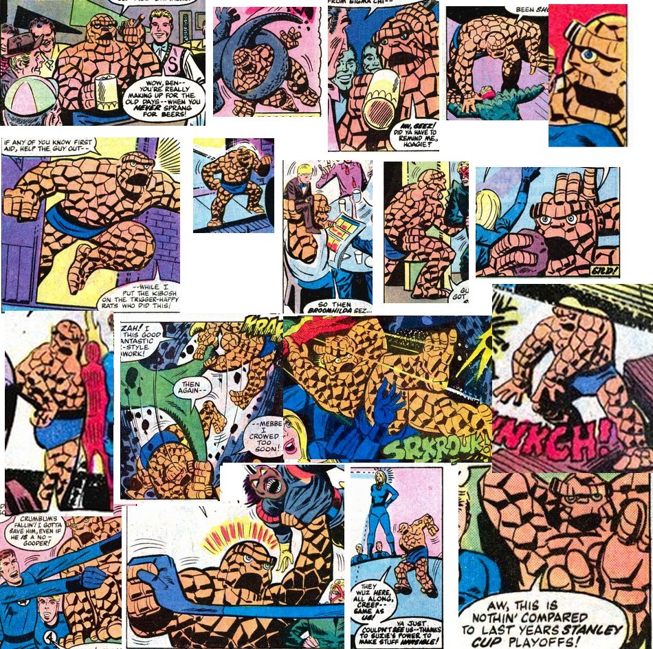
It gets worse. While Ditko has a wide range of emotions for Ben...
To finish off the foursome, Ditko's Johny Storm also has a range of emotions
And once again Byrne's version is limited to perhaps two or three faces.
Ditko's freedom extends to his characters' bodies. I love his Sue!
She moves freely, bends, twists, leans, holds, crouches, turns, waves...
even her hair is soft and real and not just soldered onto her head.
Ditko's Sue is as real as any real woman.
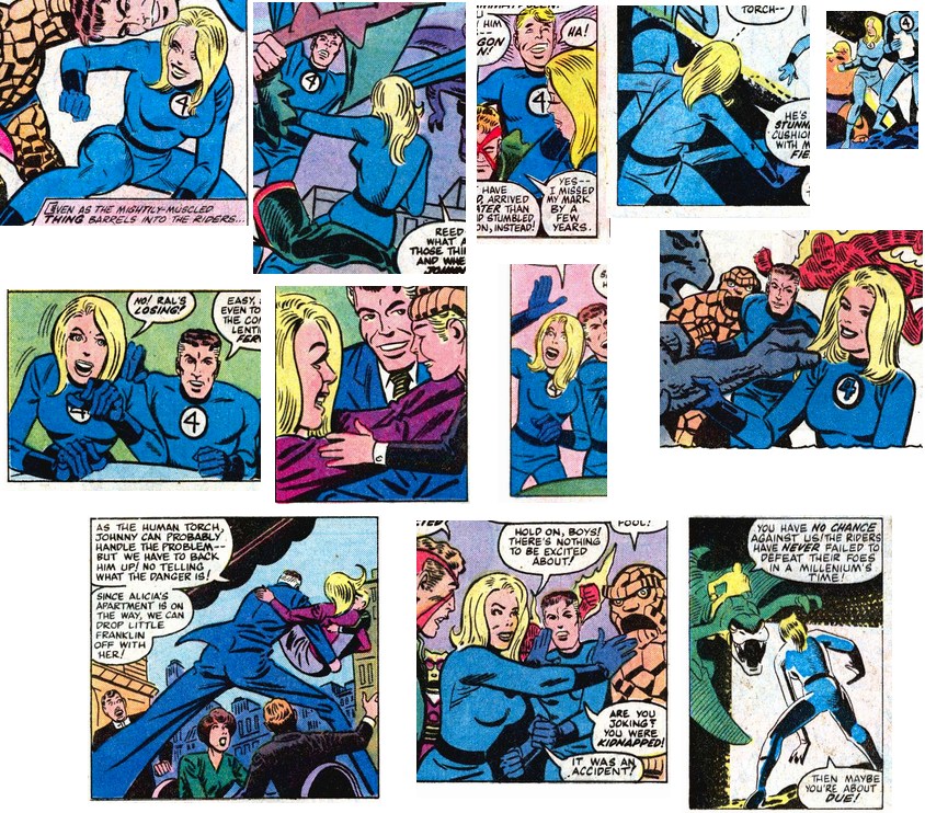
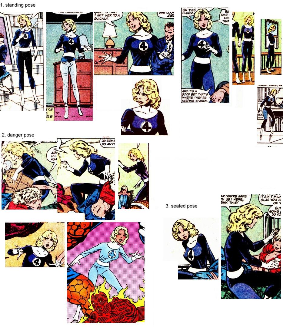
Now compare Byrne's Sue. She looks beautiful, but Byrne does not have Ditko's freedom to put the story first: Byrne is restricted by the need for his Sue to always look photographically perfect. In his earlier issues (from FF 232) Byrne does manage to give Sue some flexibility, but the photographic style and small images mean she can never show the flexibility of a real woman. Here in FF annual 17 we see the extreme result: Byrne's Sue barely moves at all.
But Byrne's Reed is far more limited in annual 17. He has a signature pose for the
cover poster, but is otherwise limited to one arm stretch and one whole
body dive. The rest of the time he just stands there (or once, sits
there).
The need to be photographic is made worse by the decision to look black costumes., Bright blue looks cartoony, but at least allows us to easily see edges. Black looks more sophisticated because it is subtle, but subtlety is the whole problem. Subtlety is the enemy of clarity. Imagine if Reed were to twist himself into a knot: in a light blue costume we could see it clearly, due to edges and shadows. But in a black costume he would be a shapeless black blob. So as the years went on and each artist tried to be photographic, Reed stretched less and less.
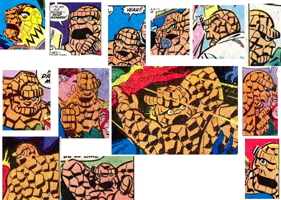
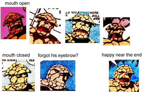
As for Ben this is where Byrne's photographic approach is most
restricting. First look at how Ditko is free to draw Ben in any
position. His Ben fully occupies his three dimensional space!
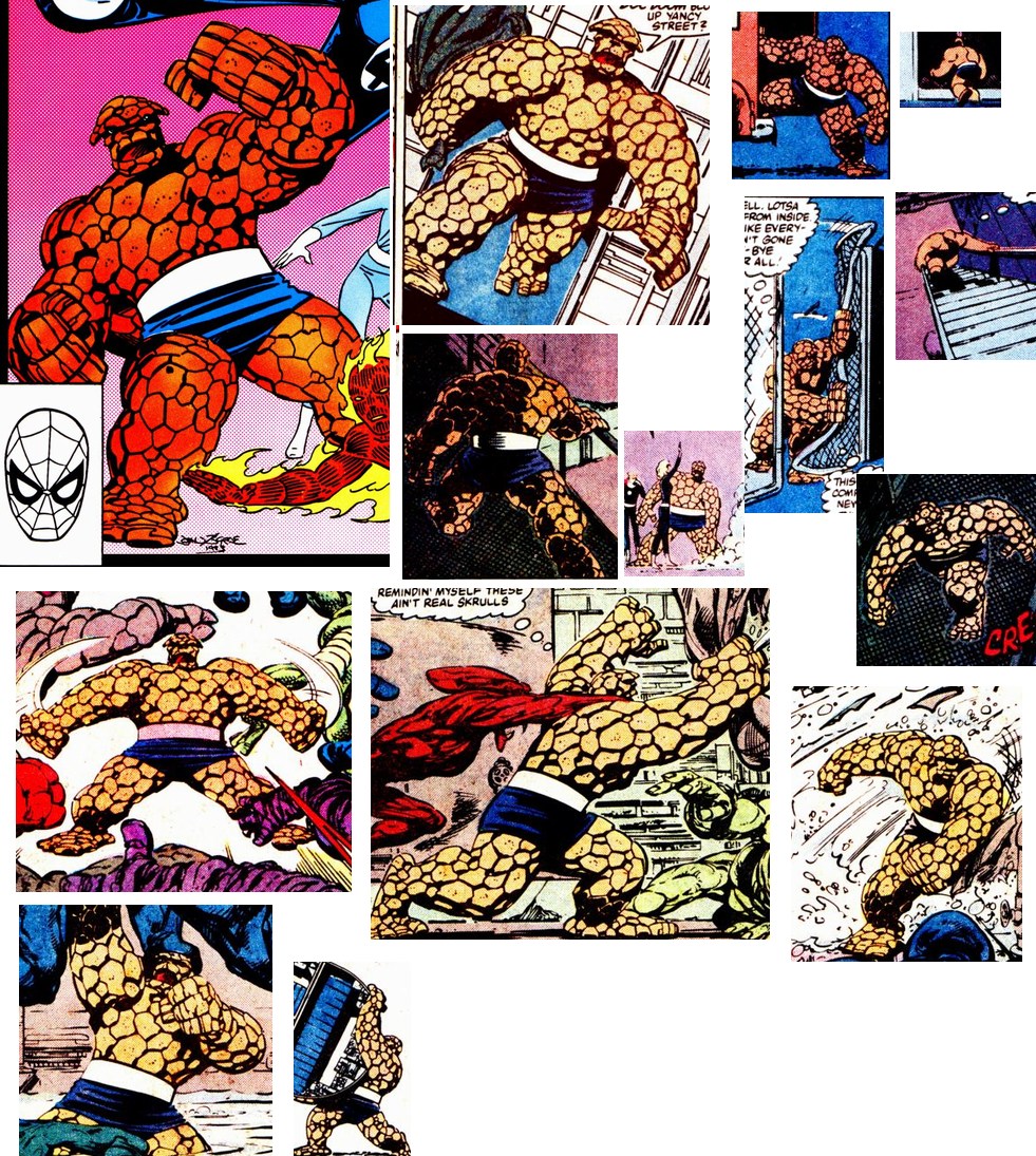
Now compare Byrne's more photographic Ben and his very limited movements. And yet he is not even photographic: the pattern of rocks changes every frame anyway. So why even pretend?
And finally the same goes for Johnny Storm: he moves and bends in all
different ways. And note how his flame version bulges in odd ways: this
is exactly what would happen if his body was covered in billowing
plasma.
Byrne's Johnny Storm probably has the widest range of poses, but compared with Ditko's version he's stiff and restricted.
In short, Byrne's characters are again limited by their need to be almost photographic. They can only emote and move like stiff plastic dolls. Whereas Ditko's characters can emote and act like people.
Ditko's art, by allowing a wider range of images, allows a broader, deeper story.
Byrne's story is remarkably two dimensional. It's about good guys (us) and irredeemable bad guys (them). There is no gray area: the bad guys look like monsters and evil is literally in their genes.
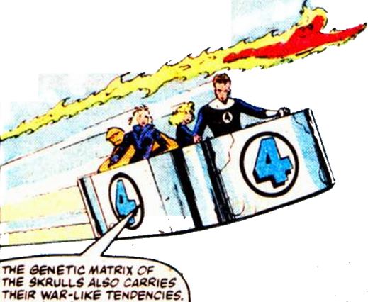
The only hint of subtlety is that these bad guys are good guys who have been polluted. But a scientific deus ex machina will instantly fix that. Then everything was like it was in the beginning: the story had no consequences: it was literally inconsequential.
In contrast, Ditko's story (technically by Hannigan, but it had Ditko's fingerprints on it) dealt with a complex moral problem: who is the bad guy? Both sides appear bad (one is a major criminal the other is hunting him like down in a pack), yet both sides also appear good. On checking the "bad" guys we find they are actually incapable of doing evil!
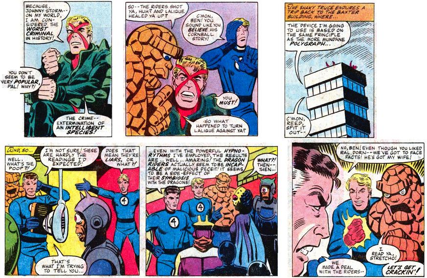
So what do you do? Nobody with an "evil Skrull gene" here, yet the results are far more serious: the wiping out of an intelligent species, and nobody can save them: when they are dead they stay dead, The cartoony style allows some very grown up storytelling.
When we do finally discover the "villain" even he is not some two dimensional Skrull-villain. Consider the massive pressures upon him: responsible for countless civilizations The event that finally pushed him too far was not his fault. Yes, he finally chose to kill some intelligent animals, but in his mind this could save whole civilizations, containing billions of lives. We have to stop and think of the context.
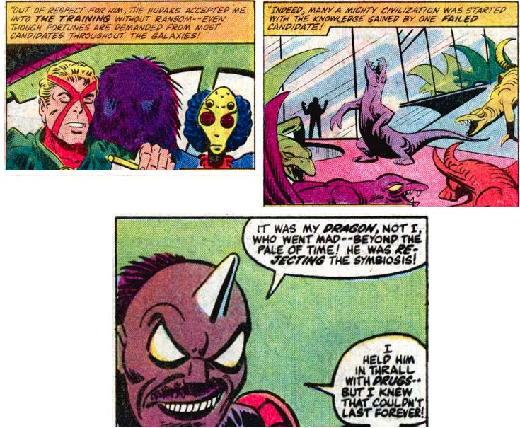
And yet the story works on multiple levels. If we don't care for the ethics and cosmic politics then it also works on the level of a bad guy with a horn in his head.
How appropriate that Ditko's story was about gladiatorial combat to the death, and Byrne's story was about milk. In this case it was meat before milk. But the meat was too much for most fans: they decided that different art meant bad art, and could not look any further.
When Jack Kirby first produced the Fantastic Four in 1961, rivals DC
were not worried. Their art was far more polished, and they had the
established characters. Kirby and Ditko produced rough looking art, with
new characters.
Yet it was alive and new! It was the 1960s, a time of looking forward,
and the fans were ready for it, and it revolutionized the industry. But
gradually
Marvel became polished and backward looking, like DC was in 1961.
The 1980s were not like the 1960s. The 1980s were a time of nostalgia, of looking backward. By the 1980s most fans wanted Byrne's stories: polished art, and old familiar villains. Nobody wanted Ditko's rougher art and brand new characters. But Ditko does not do "Old".
Ironically, Byrne wanted to go back to basics, creating a homage to the earlier stories. His title "legacy" refers to the past. Yet his story is nothing like Stan and jacks whereas Ditko's is exactly like it! Look at that splash page, every element is there: the layout, the hyperbole, the excitement, the fun credits, hitting the ground running, the whole plot summarized in a few words, and above all, new and completely different major characters.
Ditko offered the true spirit of the Fantastic Four and nobody wanted it. Instead they wanted a slow moving story that starts with a scantily clad girl bending over but doing nothing, and later has her tied up on a bed. I suppose that means comics have "grown up."
Everyone has a different idea of art. The best comic art pushed forwards: it is fresh and raw. it should be sometimes dark, sometimes silly, and not shy away from difficult big questions. It should be mind expanding and exhilarating, it should be beautiful, but above all it should be new.
But that's just my opinion.
Everyone's taste is different.